
Objective
To design a illustration for a small business that accurately represents their brand and appeals to their target audience.
My Role

Creative Process
1. Form Exploration
The project started by dissecting the structure of the number 7 and the letter Y, sketching out possible ways the two could be merged into a single symbol. I explored dozens of concepts in my sketchbook using freehand ink drawings. From filled counters to overlapping forms and negative space explorations, I looked for combinations that felt energetic, youthful, and distinct.
2. Digital Refinement
Promising sketches were translated into Illustrator, where I experimented with scale, line weight, and spacing. I created several variations to test visual clarity, especially at small sizes. The most successful versions balanced the sharp angular form of the 7 with the branching energy of the Y.
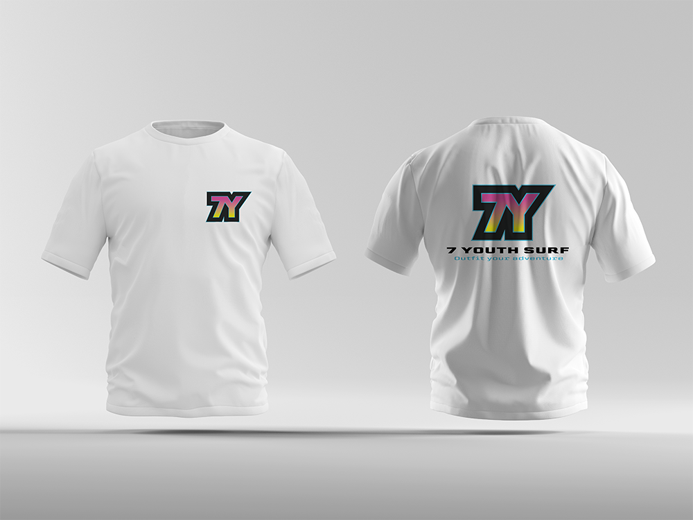
3. Brand Creation: 7 Youth Surf
Once the symbol was locked in, I brainstormed industries that fit the shape, tone, and attitude of the mark. The outcome: 7 Youth Surf, a fictional surfwear and youth gear brand that blends color, motion, and modern street sport energy.
4. Signature & Lockups
I created both primary and secondary logo signatures, testing horizontal and vertical configurations. I explored tagline placement, type pairing, and spacing to ensure strong visual hierarchy. A wide range of color variations were tested for digital and print use, with several expressive palettes showcasing the brand’s adaptability and youthful energy.
Results
7 Youth Surf feels bold, confident, and distinctly youthful. The custom mark combines the number and letter into one energetic shape, perfectly suited for an active brand. Through this project, I learned how to turn a type exploration into a scalable identity—one with a name, a vibe, and a voice that can live across real-world brand materials.